轉自 https://www.patreon.com/posts/gpt-image-2-quan-156236695
--
GPT-Image-2 全方位圖像實戰壓力測試:從字體、排版、指令遵從、風格到品牌廣告 22 題看清真實實力!
Prompt Case
20小時前
Author: Prompt Case
GPT-Image-2 是 OpenAI 最新一代的原生圖像生成模型,現在已經在 ChatGPT / API 裡開始上線,用自然語言就能直接生成或編輯高品質圖片。
和上一代 GPT-Image-1.5 系列相比,它在幾個關鍵點有明顯提升。更準確的文字渲染(包含中日韓等非拉丁文字)、更穩定的排版與空間理解,以及更高真實度的場景與材質表現,官方也把它定位成「適合做真正可以拿來用的設計與視覺」的等級。
如果你是設計師、插畫家、前端或內容創作者,這套 GPT-Image-2 測試集會幫你快速看清,它到底能不能做出「真的能拿去用」的圖。
包括可讀的標題與小字、可印刷的版面、可信的商品包裝、SaaS 網站、雜誌內頁、資訊圖表,甚至是漫畫分鏡與廣告視覺。
我把 22 題拆成幾大模組:文字渲染與資訊階層、排版與 UI、長指令與禁止項、材質與寫實、風格控制,以及混合壓力題,每題都寫出具體 prompt 和評分規則,方便你複製實驗、微調 prompt,或拿來測別家的模型。
A. 文字渲染壓力測試
1. 英文海報,測大字、小字、階層感
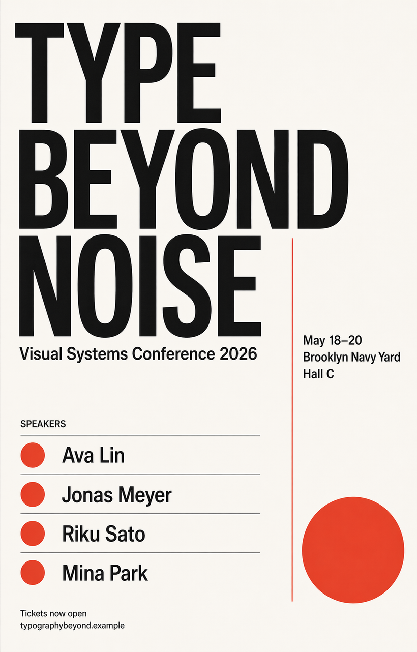
Prompt
Create a premium Swiss-style typography poster for a fictional design conference.
Canvas ratio: 4:5 vertical.
Design style: minimal, clean grid, editorial, high-end print poster.
Color palette: off-white background, black text, one accent color only.
The poster must contain these exact text elements with clean hierarchy and perfect spelling:
MAIN TITLE:
TYPE BEYOND NOISE
SUBTITLE:
Visual Systems Conference 2026
INFO BLOCK:
May 18–20
Brooklyn Navy Yard
Hall C
SPEAKERS:
Ava Lin
Jonas Meyer
Riku Sato
Mina Park
FOOTER:
Tickets now open
typographybeyond.example
Rules:
- The main title must be large and dominant
- The subtitle smaller but still clearly readable
- The info block compact and aligned
- The speakers section must look like a real poster lineup
- The footer must be tiny but still legible
- No fake extra text
- No gibberish
- Strong negative space
- Print-ready, polished, tasteful
測試點
測文字渲染品質(拼字、字距)與資訊階層是否清晰。
好的判斷準則
所有英文字完全正確、沒有拼錯或亂碼。
主標題最大最醒目,其次是副標題,再來是資訊區和講者名單,視覺層級一眼可讀。
版面像真實高級設計海報,有充足留白、整齊對齊,沒有多餘裝飾。
不好的判斷準則
出現假字、亂碼、或把單字改掉。
標題與小字大小差異不明顯,看起來一團、層級混亂。
額外亂加句子或無意義符號,整體不像真實印刷海報。
2. 中文包裝正面,測繁體字穩定度
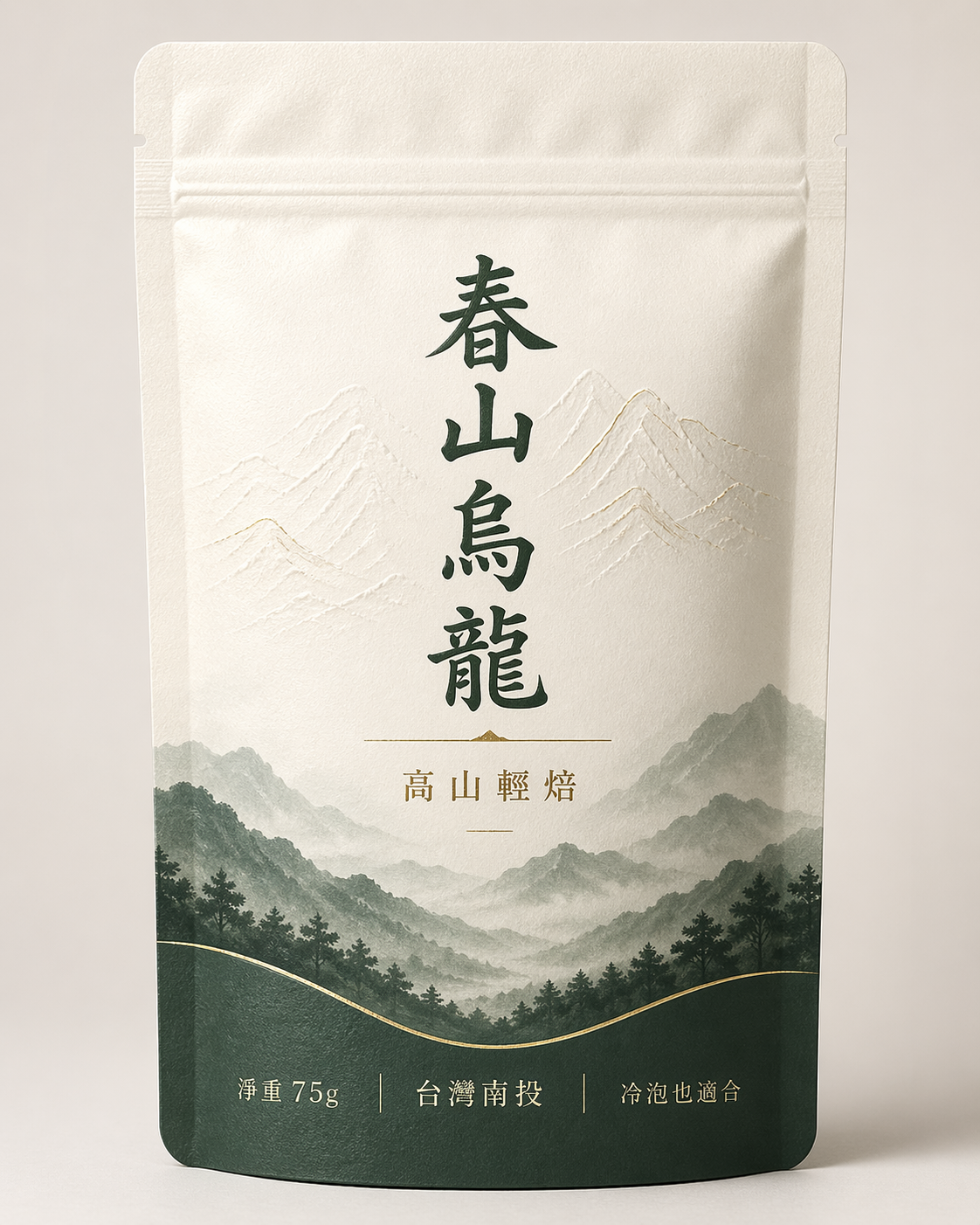
Prompt
Design the front label of a premium Taiwanese tea package.
Format: standing pouch package front view, centered, studio lighting.
Style: refined, modern, elegant, premium Asian packaging design.
The packaging must include these exact Traditional Chinese text elements:
春山烏龍
高山輕焙
淨重 75g
台灣南投
冷泡也適合
Additional rules:
- All Chinese characters must be correct and clean
- The text must feel intentionally designed, not randomly pasted
- Use strong hierarchy
- Keep the layout minimal and premium
- No extra Chinese characters
- No nonsense text
- Add subtle embossing, soft paper texture, and realistic print finish
測試點
測繁體中文字形是否正確、是否亂改字或產生怪字,及高級包裝感。
好的判斷準則
指定文字(春山烏龍、高山輕焙、淨重 75g、台灣南投、冷泡也適合)全部正確、沒有簡體混入。
文字排列有設計感(主品名最大、副文次之),版面簡潔、有精品感。
能看出紙張、燙金、壓紋等細緻材質與印刷質感。
不好的判斷準則
字被簡化、拆開、或筆畫錯誤(例如「烏」變形)。
滿版塞字、階層混亂,像亂貼貼紙而不是設計。
多加沒要求的中文字或假字,破壞真實商品感。
3. 多語言同場,測跨語系文字能力
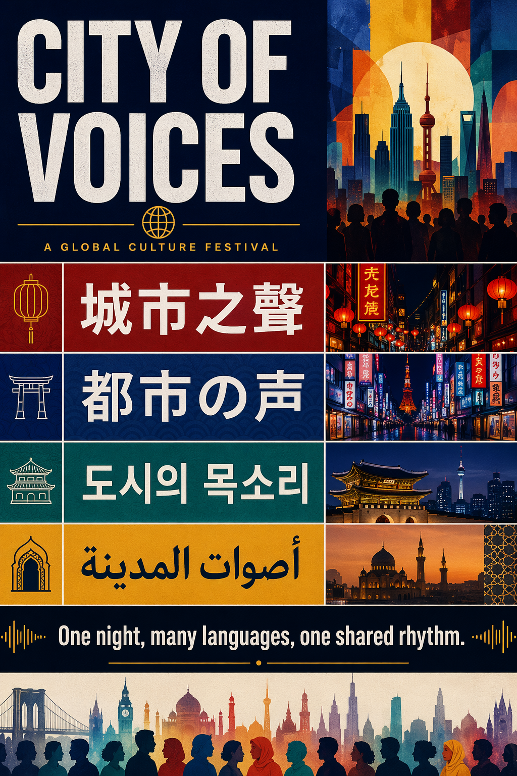
Prompt
Create a global culture festival poster with a bold contemporary editorial layout.
Poster ratio: 3:4 vertical.
Use a strong modular grid.
The poster must include these exact lines, each in its own clear block:
ENGLISH:
CITY OF VOICES
TRADITIONAL CHINESE:
城市之聲
JAPANESE:
都市の声
KOREAN:
도시의 목소리
ARABIC:
أصوات المدينة
Below them add this exact line:
One night, many languages, one shared rhythm.
Rules:
- Every script must be clean and readable
- Do not merge scripts incorrectly
- Keep strong visual harmony across all writing systems
- No fake filler text
- Make it feel like a real cultural event poster
- Bold but tasteful
測試點
測模型在同一畫面處理多種文字系統(中、英、日、韓、阿拉伯)時的準確度與排版協調性。
好的判斷準則
每種語言的字都是正確、清晰可讀,沒有把字拆開或亂接。
不同文字塊排版和諧,大小、位置、行距平衡,像真實國際活動海報。
完全沒有額外亂加語言或假字。
不好的判斷準則
阿拉伯文方向錯誤、部分文字倒轉或斷開。
東亞文字(中、日、韓)字體氣質差異過大,看起來像拼湊。
額外填充假字、亂碼,或混錯語言。
4. 密集資訊圖,測小字與表格感
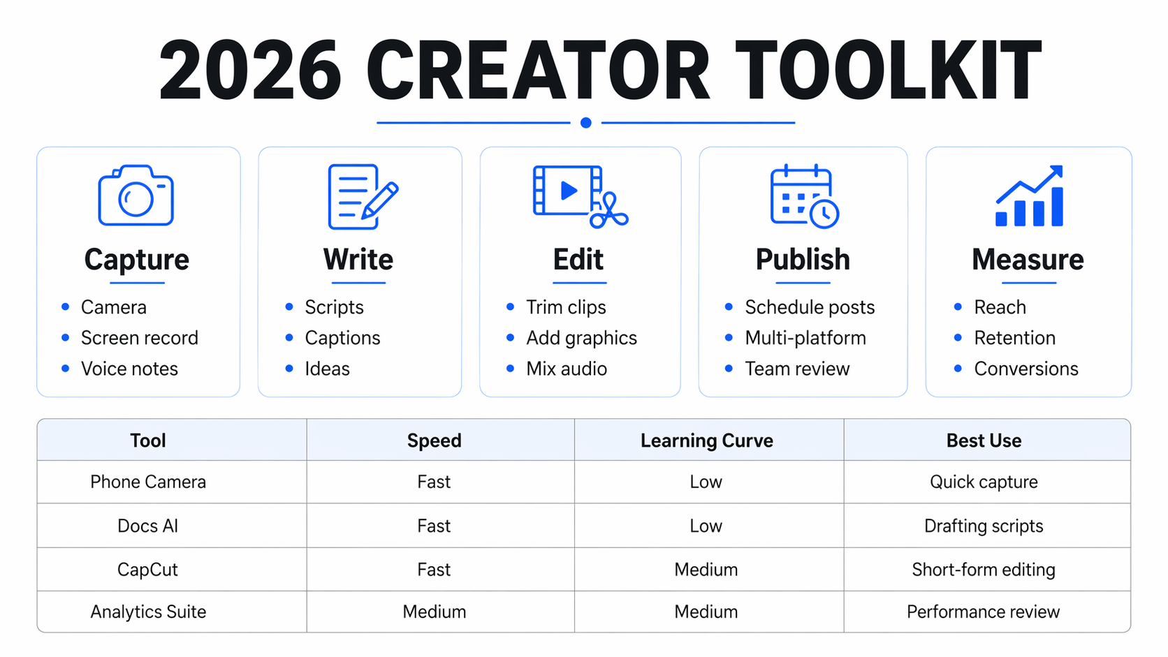
Prompt
Design a clean, modern infographic titled:
2026 CREATOR TOOLKIT
Canvas ratio: 16:9 horizontal.
Include these exact section headers:
Capture
Write
Edit
Publish
Measure
Under each header, add exactly three short bullet items with clean typography.
Also include a bottom comparison table with these exact column headers:
Tool
Speed
Learning Curve
Best Use
Add four rows with realistic short entries.
Rules:
- Everything must be legible
- No gibberish
- The hierarchy must be obvious at a glance
- Use icons sparingly
- Looks like a real keynote slide or SaaS infographic
- Crisp alignment
- White background
測試點
測資訊圖中大量小字、子彈列與表格的清晰度和對齊品質。
好的判斷準則
區塊標題(Capture / Write / Edit / Publish / Measure)一目了然,小字仍清楚。
底部表格欄位對齊整齊,四列內容短而可讀,沒有亂碼。
整張圖像有清楚資訊階層,像 SaaS 或簡報中的專業 slide。
不好的判斷準則
子彈列或表格文字糊成一團,看不清字。
表格邊界歪斜、欄位溢出,對齊感很差。
多出很多沒要求的假字、英文碎片。
B. 排版與設計能力
5. 雙頁雜誌,測 editorial sense
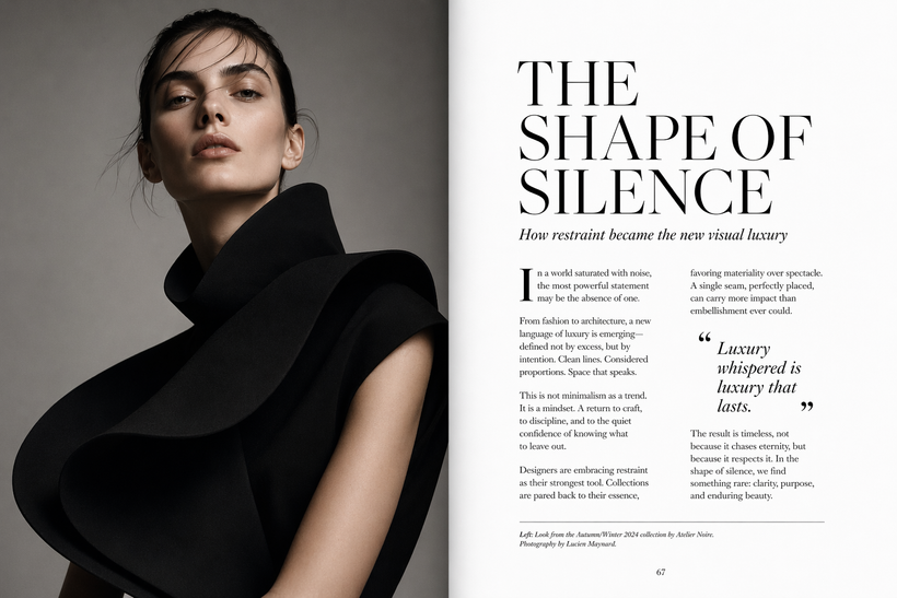
Prompt
Create a luxury fashion magazine double-page spread.
Left page:
A full-page portrait of a model in sculptural black clothing, minimal background, high-fashion editorial photography.
Right page:
A clean article layout with the exact headline:
THE SHAPE OF SILENCE
Subheadline:
How restraint became the new visual luxury
Include a realistic magazine article layout with readable paragraphs, one pull quote, one small caption, and one page number.
Rules:
- The spread must feel like a real premium magazine
- Strong editorial rhythm
- Elegant white space
- Perfect alignment
- No fake broken text
- The left and right pages must feel designed together
測試點
測左右雙頁整體節奏、照片與內文排版是否有真實時尚雜誌感。
好的判斷準則
左頁人像構圖專業、光線與色調有高級時尚雜誌感。
右頁標題、副標、內文、引言、頁碼安排合理,像可閱讀的版面。
沒有明顯假字或亂碼,即便內文略模糊,也有真實排版感。
不好的判斷準則
右頁主體是大塊假字,行距、段落完全不自然。
左右頁風格不一致,像兩張無關圖片硬拼在一起。
排版像模板貼圖,沒有雜誌的節奏與層次。
6. 三摺頁 brochure,測資訊收納
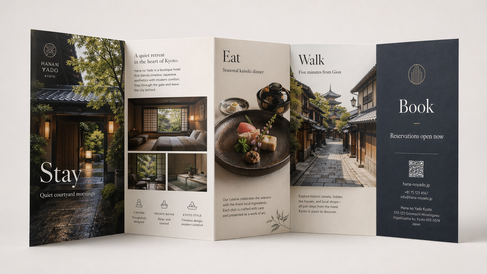
Prompt
Design a tri-fold travel brochure for a boutique hotel in Kyoto.
Show the brochure slightly opened in a realistic product mockup view.
The brochure must include these exact titles:
Stay
Eat
Walk
Book
Include these exact phrases somewhere in the design:
Quiet courtyard mornings
Seasonal kaiseki dinner
Five minutes from Gion
Reservations open now
Rules:
- Make it feel like a real printed brochure
- Distinct front panel, inside panels, and back panel
- Strong photo-text balance
- Clear hierarchy
- No gibberish
- Elegant Japanese-inspired design without clichés
測試點
測三摺頁的 panel 邏輯、資訊分區以及旅宿品牌感。
好的判斷準則
可以辨認哪一面是封面、內頁、背面,各 panel 有清楚主題(Stay / Eat / Walk / Book)。
指定句子自然分布在適合的位置,和照片排版平衡。
整體風格有京都精品旅店感,不落入刻板「和風 clipart」。
不好的判斷準則
看不出摺頁邏輯,像一張隨機多欄海報。
文字堆在某一邊,另一邊空白或內容重複。
加入過多無關裝飾圖示,破壞精品感。
7. App landing page,測 UI 排版和信息層級
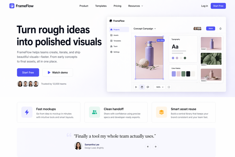
Prompt
Create a polished landing page mockup for a creative app called FrameFlow.
Desktop web layout, 16:10 ratio.
Must include these exact UI text elements:
FrameFlow
Turn rough ideas into polished visuals
Start free
Watch demo
Trusted by 12,000 teams
Below the hero section, add three feature cards with these titles:
Fast mockups
Clean handoff
Smart asset reuse
Below that, add a testimonial block with:
“Finally a tool my whole team actually uses.”
Rules:
- It must look like a real modern SaaS landing page
- Excellent spacing
- Realistic UI structure
- Soft shadows, glassmorphism only if tasteful
- No nonsense UI text
- Buttons must look clickable
測試點
測是否能生成「真的可用」的 SaaS 登入頁布局,而非單純裝飾網站感。
好的判斷準則
有清楚 hero 區、標題、CTA 按鈕(Start free / Watch demo)、社會信任文字與後方 UI 示意。
三個 feature 卡與 testimonial 區塊位置合理、層級分明。
文字可讀、按鈕像可點擊 UI,而非硬貼字。
不好的判斷準則
版面像海報而不是網站,缺少明確版頭、主欄與內容區。
卡片/按鈕邊界模糊,看不出可互動區域。
把指定文字打亂、改寫或加一堆行銷廢話。
C. 長指令理解與約束遵守
8. 物件數量、位置、顏色,鋪排
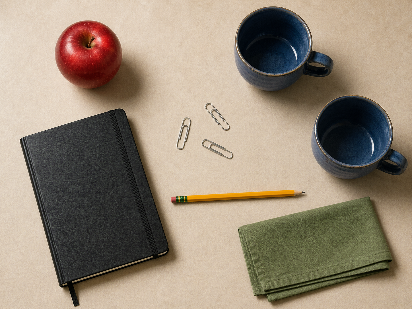
Prompt
Create a top-down still life scene on a warm beige table.
The scene must contain exactly these objects:
- 1 red apple
- 2 blue ceramic cups
- 3 silver paper clips
- 1 closed black notebook
- 1 yellow pencil
- 1 folded green napkin
Placement rules:
- The red apple must be near the top left
- The two blue cups must be on the right side, not touching each other
- The three silver paper clips must form a loose triangle near the center
- The black notebook must be near the bottom left, angled slightly
- The yellow pencil must be horizontal
- The green napkin must be near the bottom right
Rules:
- Do not add any extra objects
- Realistic lighting
- Natural shadows
- Photorealistic materials
測試點
測模型對「數量、顏色、位置」這種細節約束的遵守程度。
好的判斷準則
每個物件數量完全正確(1/2/3),沒有多也沒有少。
物件位置符合指示(例如蘋果在左上、杯子在右側不相碰)。
沒有出現任何沒要求的新物件。
不好的判斷準則
數量錯誤或模糊,例如出現第四個迴紋針或桌上多了其他雜物。
位置分布與指示明顯不符。
顏色錯誤,例如藍杯變白杯、紅蘋果變黃等。
9. 角色設定表,測一致性
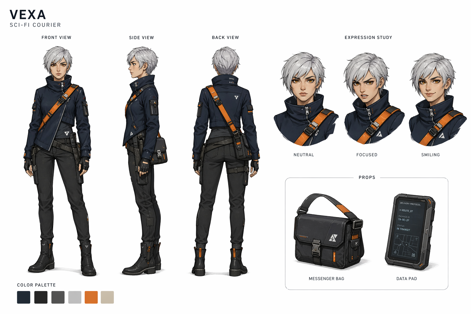
Prompt
Create a professional character design sheet for an original female sci-fi courier.
Show:
- front view
- side view
- back view
- three facial expressions
- one small props section
Character details:
- short silver hair
- amber eyes
- asymmetrical navy jacket
- orange utility strap across the chest
- compact messenger bag
- slim black boots
Rules:
- The same character identity must remain consistent in every view
- Proportions must match
- Outfit details must repeat correctly
- Clean white background
- Looks like a real animation pre-production sheet
- Add neat labels only where useful
測試點
測同一角色在多視角、多表情下是否保持特徵與服裝一致。
好的判斷準則
頭髮長度、臉型、眼睛顏色、外套細節、背帶位置等在所有視角一致。
三種表情只是表情變化,不是換了一張臉。
道具區畫出的物件(包包、靴子)與角色身上的版本一致。
不好的判斷準則
側面與正面的五官比例明顯不一樣,像不同人。
服裝細節在不同視角消失或變形(例如背帶消失)。
表情圖變成風格不同的畫。
10. 禁止項測試,測是否亂加元素
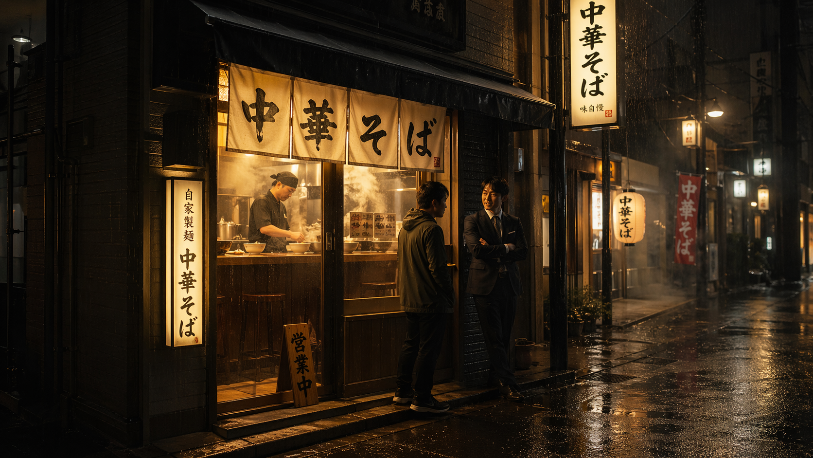
Prompt
Create a cinematic nighttime ramen shop street scene in Tokyo.
Include:
- one chef inside the shop
- two customers outside
- light rain
- warm interior light
- reflective wet pavement
- realistic steam from the kitchen
Important exclusions:
- no umbrellas
- no bicycles
- no cats
- no cars
- no neon pink
- no English signage
Use only Japanese signage.
Make it photorealistic and atmospheric.
測試點
測是否能嚴格遵守「不可以出現的東西」清單。
好的判斷準則
畫面裡只有要求的場景元素(廚師、兩位客人、雨、蒸氣等),完全沒有雨傘、車、貓、腳踏車等。
夜晚街景有氛圍,但色彩控制在合理範圍,沒有霓虹粉。
招牌全部為日文,看起來符合場景。
不好的判斷準則
出現任一禁用項(例如背景有停車、有人撐傘)。
把霓虹粉當作主色光源。
掛出英文招牌或亂碼。
11. 畫中畫遞迴,測空間邏輯
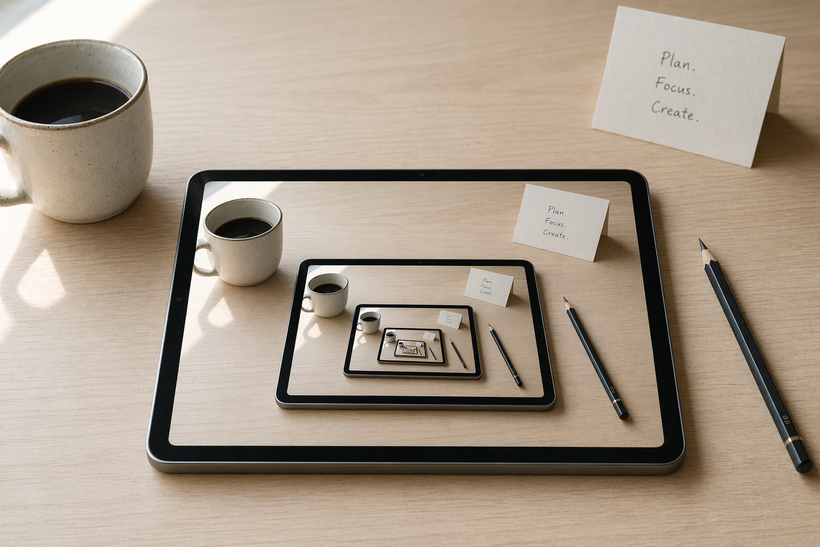
Prompt
Create a realistic desk scene with a tablet lying on the desk.
On the tablet screen, show the exact same desk scene from a slightly tighter crop.
Inside that tablet screen, show the same scene one more time, again slightly tighter.
Rules:
- Three visible recursion levels total
- Perspective must stay believable
- Lighting must remain consistent
- The scene should contain a coffee cup, a pencil, a folded note, and the tablet
- Minimalist desk, daylight from the left
- Photorealistic
測試點
測畫中畫遞迴的層級控制、物件一致性與透視邏輯。
好的判斷準則
可以清楚辨認三層畫面,每層構圖稍微緊一些但一致。
咖啡杯、鉛筆、紙條等物件在三層中都出現,沒有突然消失。
光線方向與陰影在所有層都一致,不會亂掉。
不好的判斷準則
裝置裡的畫面變成其他桌面或完全不同場景。
遞迴層數不正確(少於三層或無限鏡像)。
透視扭曲到不合理,桌面角度在不同層完全不連續。
D. 材質渲染壓力測試
12. 玻璃、金屬、霧面塑膠,一張打包
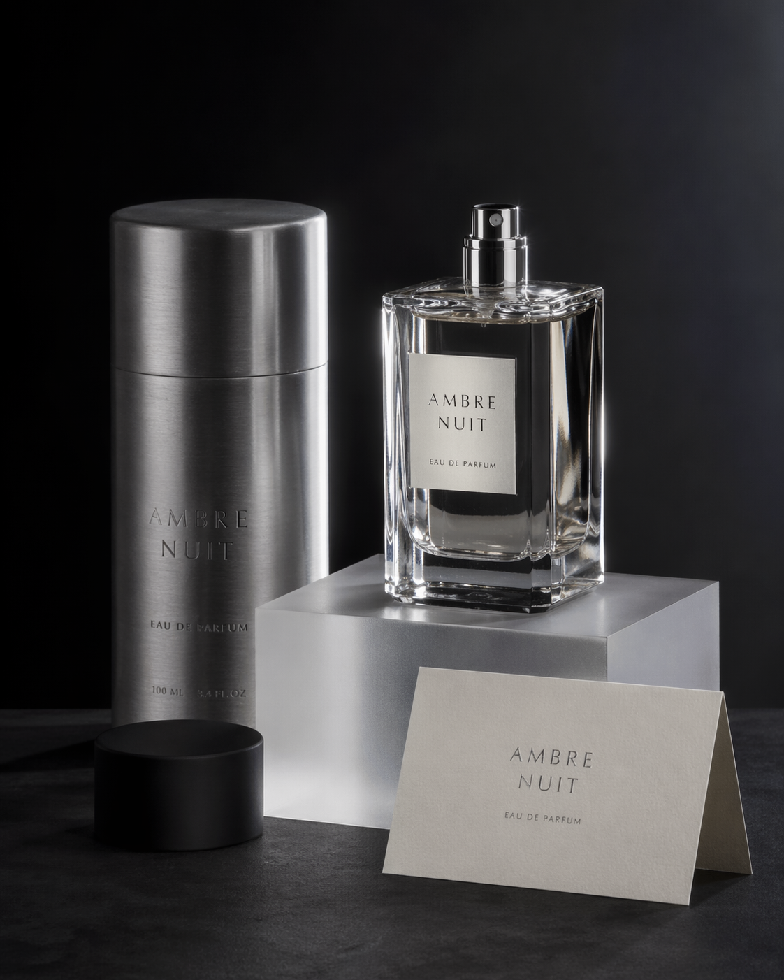
Prompt
Create a premium product still life in a dark studio.
Objects:
- a clear glass perfume bottle
- a brushed aluminum cylinder
- a matte black plastic cap
- a frosted acrylic display block
- a folded ivory paper card
Lighting:
- one strong rim light from the back right
- one soft fill from the front left
Rules:
- Each material must feel unmistakably different
- Realistic reflections and refractions
- No floating objects
- Luxury beauty campaign quality
- Extremely clean composition
測試點
測多種不同材質(玻璃、金屬、霧面塑膠、亞克力、紙張)在同一畫面中的區分度與光影控制。
好的判斷準則
每個物體的材質一眼可辨:玻璃透光、金屬高光、霧面材質柔和、紙張有輕微纖維感。
反射與折射邏輯合理,沒有詭異扭曲。
整體構圖乾淨、有高級精品攝影感。
不好的判斷準則
金屬看起來像塑膠,或霧面材質反光過度。
玻璃邊緣糊掉、瓶身變成實心物體。
物件漂浮或投影方向混亂。
13. 布料質感,測纖維與褶皺
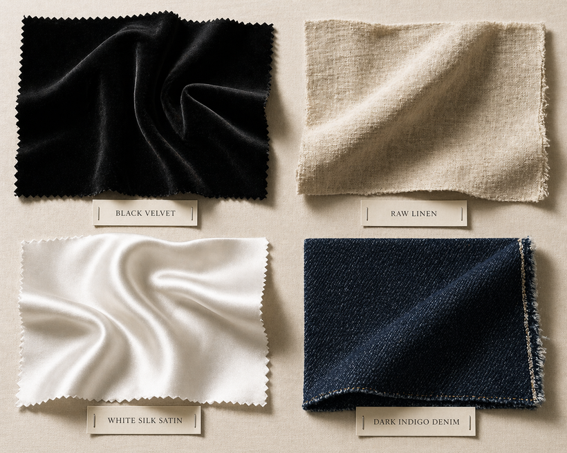
Prompt
Create a fashion material study board showing four fabric swatches.
Show these materials clearly:
- black velvet
- raw linen
- white silk satin
- dark indigo denim
Arrange them on a neutral background with small labeled tags.
Rules:
- Each fabric must have accurate weave, sheen, and drape behavior
- Close-up, high detail
- Soft studio lighting
- Realistic shadows
- Looks like a luxury fashion atelier reference board
測試點
測不同布料(天鵝絨、麻、絲緞、牛仔)在質感、光澤、織紋表現上的細節。
好的判斷準則
黑絲絨有深邃吸光感;亞麻有明顯粗細纖維與自然皺褶。
白絲緞有流動高光但不塑膠;丹寧有清楚斜紋與微舊感。
標籤清楚標示每塊布料,整體像材質研究板。
不好的判斷準則
四種布料看起來材質相似,只是顏色不同。
絲或緞像 PVC、過於硬挺;亞麻太平滑。
標籤文字糊成一團或錯置。
14. 食物寫實,測蒸氣、油脂、濕潤感
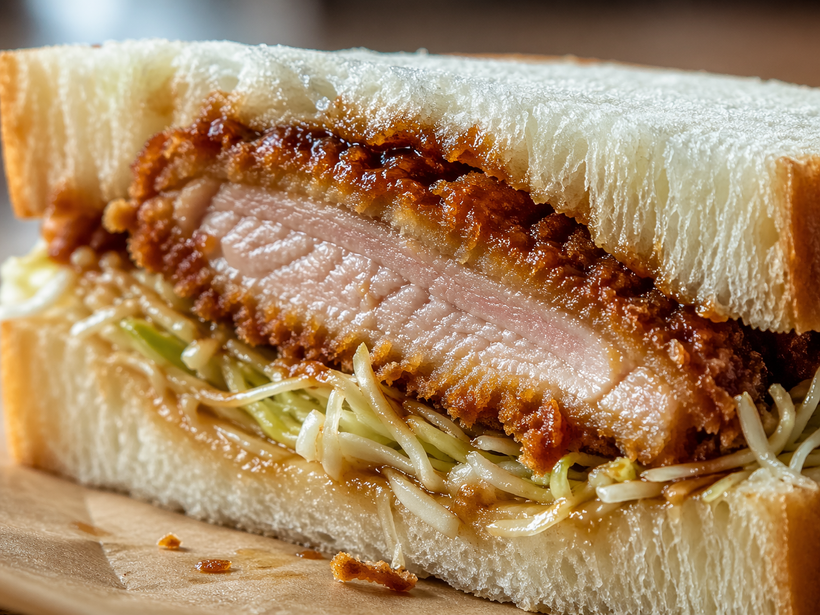
Prompt
Create an extreme close-up food photograph of a freshly sliced tonkatsu sandwich.
Details to show:
- crisp golden breaded cutlet
- juicy interior
- soft milk bread
- glossy sauce
- fine cabbage strands
- tiny crumbs on the paper wrap
Lighting:
- natural window light
- shallow depth of field
Rules:
- Make it look like an expensive food magazine shoot
- Strong texture contrast
- Realistic moisture, crumbs, and soft bread compression
- No extra ingredients
測試點
測高寫實食物攝影中,酥脆、多汁、濕潤等細節表現。
好的判斷準則
炸衣酥脆、麵包壓痕自然、肉質多汁,醬汁與油光真實。
高解析度可看到細碎麵包屑與高麗菜絲。
整體像高級美食雜誌封面照。
不好的判斷準則
炸物表面糊成一片、沒有細節;麵包像塑膠。
油與醬汁太假、過亮或像膠水。
加入沒要求的配菜、餐具,分散主體。
15. 珠寶微距,測高光控制
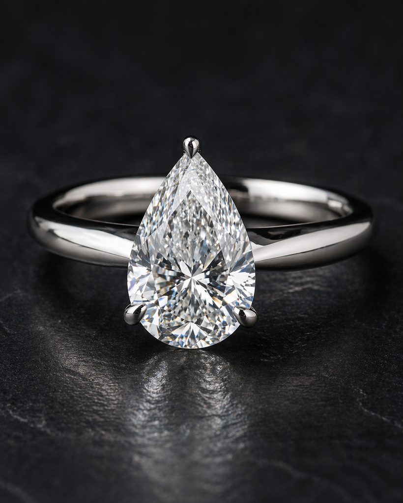
Prompt
Create a macro jewelry photograph of a platinum ring holding a pear-cut diamond.
Scene:
- dark charcoal background
- a hint of soft dust-free luxury surface
- close-up framing
Rules:
- The platinum must show refined metallic reflections
- The diamond must sparkle realistically without looking fake or overblown
- Accurate prongs
- Extremely sharp focus on the stone and ring head
- Premium luxury ad quality
測試點
測微距珠寶攝影的高光、折射與細節銳利度。
好的判斷準則
鉑金戒台邊緣銳利、反光細緻;鑽石切面明確、閃爍自然。
焦點精準在鑽石與戒台頭部,背景柔和。
整體氛圍高級、不浮誇,適合奢侈品廣告。
不好的判斷準則
鑽石變成一顆白色糊球或像塑膠寶石。
金屬邊界糊掉、表面像鍍銀塑膠。
焦點錯在背景或畫面整體過糊。
E. 風格切換與藝術控制
16. 同一主題換六種風格
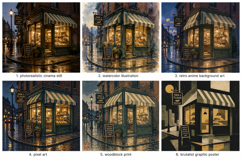
Prompt
Create a six-panel comparison sheet of the same subject:
a small corner bakery on a rainy street at dusk
Show the exact same scene in these six styles:
1. photorealistic cinema still
2. watercolor illustration
3. retro anime background art
4. pixel art
5. woodblock print
6. brutalist graphic poster
Rules:
- Keep the composition broadly consistent across all six panels
- Make each style clearly distinct
- The bakery identity must remain recognizable
- Label each panel cleanly
- No extra random scenes
測試點
測在保持同一主題與構圖下,切換六種風格的能力與主體一致性。
好的判斷準則
六格中都能認出同一間小麵包店與雨中街景。
每種風格語彙(寫實、水彩、像素、版畫等)清楚區分。
六個 panel 位置標示清晰,沒有混亂。
不好的判斷準則
部分風格變成完全不同場景或店家。
像素風格/木刻風格只是加濾鏡感,沒有真正轉譯風格元素。
標籤順序錯亂或文字不可讀。
17. 復古膠片感,測氣氛控制
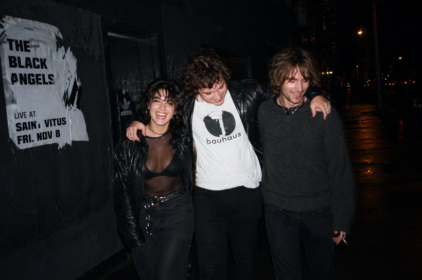
Prompt
Create a candid 35mm flash photograph of three friends leaving a small music venue at midnight.
Mood:
- imperfect
- alive
- slightly messy
- authentic
Visual details:
- direct on-camera flash
- deep shadows
- mild motion blur
- realistic skin texture
- wet sidewalk
- one torn concert poster on the wall
Rules:
- It must feel like a real accidental iconic photo
- Not too polished
- Avoid plastic skin
- No surreal elements
測試點
測不「過度美化」的寫實瞬間感、35mm 閃燈氣質與真實人像。
好的判斷準則
有閃燈直打的生硬光線、真實皮膚紋理、適度噪點。
架構有隨機性與動感,像抓拍而不是精心擺拍。
整體情緒真實、有故事感,不會太 HDR 或太乾淨。
不好的判斷準則
人物皮膚像塑膠、磨皮過度。
畫面太廣告感、過度精緻,失去「意外經典」的味道。
加入不必要的超現實元素或特效。
18. 漫畫頁,測敘事和分鏡
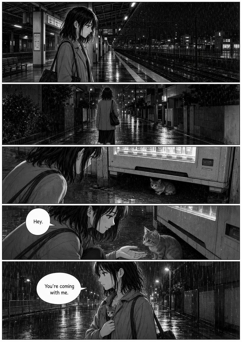
Prompt
Create a black-and-white manga page with 5 panels.
Story:
A young woman misses the last train, walks home alone, notices a small cat under a vending machine, kneels down, smiles, and carries it under her jacket into the rain.
Rules:
- The character must stay consistent across all panels
- Strong cinematic pacing
- Clear panel composition
- Speech bubbles minimal
- Only these exact two lines of dialogue:
“Hey.”
“You’re coming with me.”
- No extra dialogue
- Readable lettering
- Emotional but restrained
測試點
測多格漫畫連續敘事能力、角色一致性與分鏡節奏。
好的判斷準則
5 格之間故事連續、動作銜接自然,看得出明確起承轉合。
女主角在每格的臉型、髮型、服裝一致。
對話框僅有兩句指定台詞,位置恰當、字可讀。
不好的判斷準則
角色外貌在不同格差異太大,像不同人。
分鏡難以理解,關鍵動作被切掉或順序錯亂。
多出一堆沒要求的對話或文字。
F. 混合壓力題,專門拿來挑戰模型
19. 海報加寫實人物加可讀文字
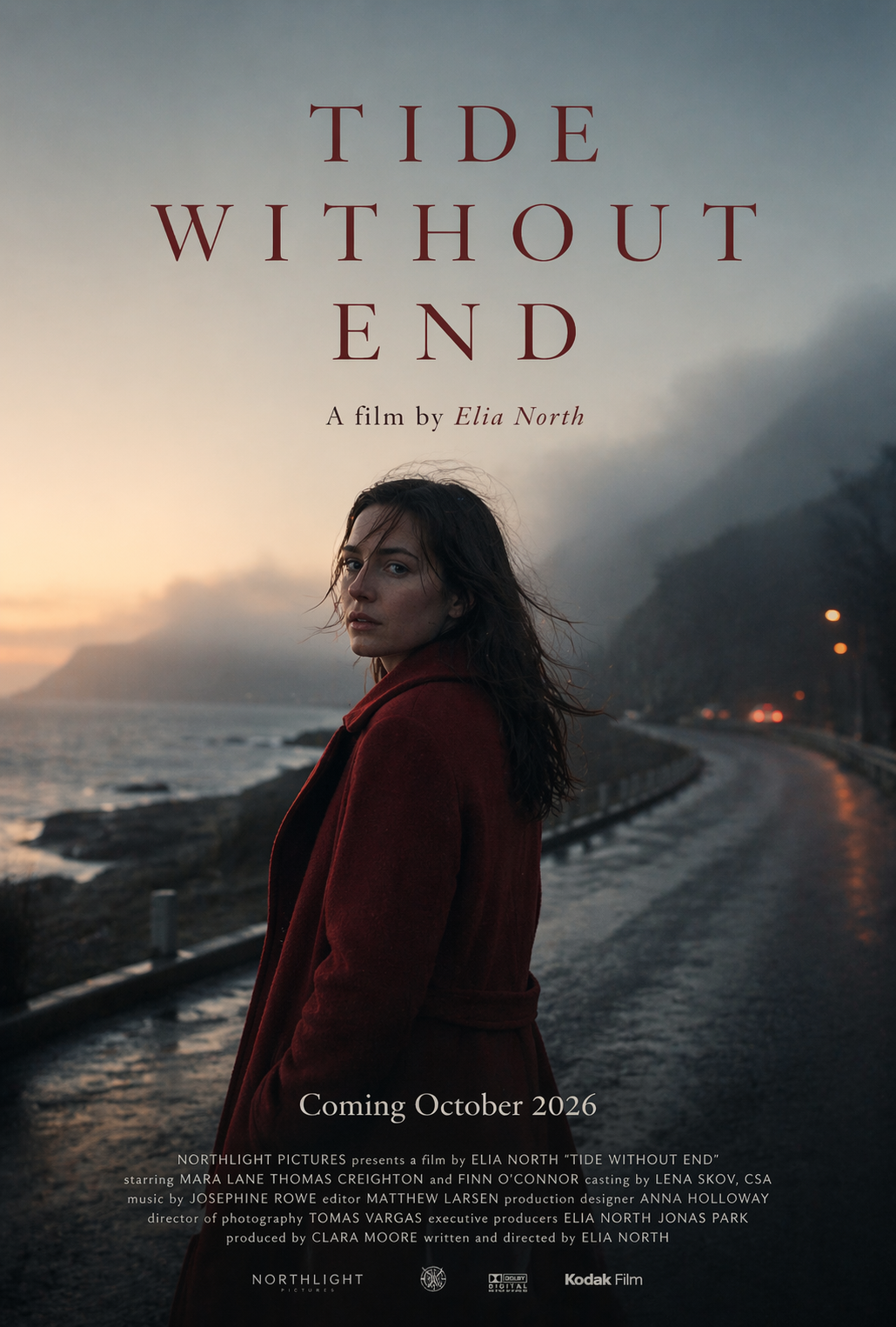
Prompt
Create a campaign poster for a fictional independent film.
Poster ratio: 27x40 portrait.
Main image:
A woman in a red coat standing on a foggy seaside road at dawn, looking back over her shoulder.
Add these exact text elements:
TIDE WITHOUT END
A film by Elia North
Coming October 2026
Billing block at the bottom should look realistic but remain readable.
Rules:
- High-end arthouse poster design
- Strong mood
- Film still quality portraiture
- Elegant typography
- No fake credits
- No extra taglines
- Print-ready composition
測試點
測真人寫實、海報設計與可讀文字(標題+ credit block)同時成立的能力。
好的判斷準則
人物表情、姿態與光線有電影劇照感。
片名、導演名、上映日期排版合理,底部 credit block 仿真但可讀。
沒有額外 tagline 或亂加的賣點文字。
不好的判斷準則
Credit block 變成完全亂碼或疊在一起。
人像與字體風格不合,像是把照片貼在別的海報上。
額外添加沒要求的 slogan。
20. 資訊圖加人物插畫加表格
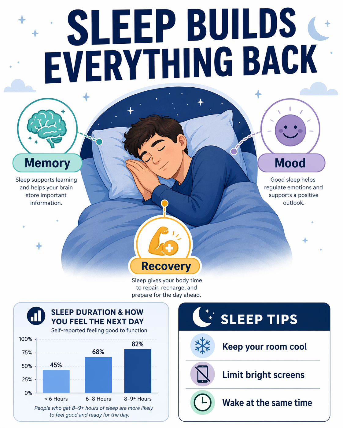
Prompt
Create a polished educational infographic about sleep.
Canvas ratio: 4:5 vertical.
Sections required:
- title area
- illustrated central figure
- three benefit callouts
- one small bar chart
- one practical tips box
Use these exact text elements:
SLEEP BUILDS EVERYTHING BACK
Memory
Mood
Recovery
Keep your room cool
Limit bright screens
Wake at the same time
Rules:
- Strong visual hierarchy
- Clean typography
- Useful infographic feel
- The illustrated figure must integrate naturally with the layout
- No fake medical claims
- No gibberish
測試點
測資訊圖排版、角色插畫融合度,以及小圖表與實用資訊的整合。
好的判斷準則
標題區、中央人物、三個 benefit、條列 tips、柱狀圖位置分明。
插畫人物與排版整合自然,不會像浮在畫面上。
所有文字清楚、無假醫療宣稱或亂碼。
不好的判斷準則
圖表與人物互相遮擋,資訊層級模糊。
小字變成亂碼或無法閱讀。
加入誇大醫療數據、違反原始「不亂編」精神。
21. 極長指令,測記憶與統整
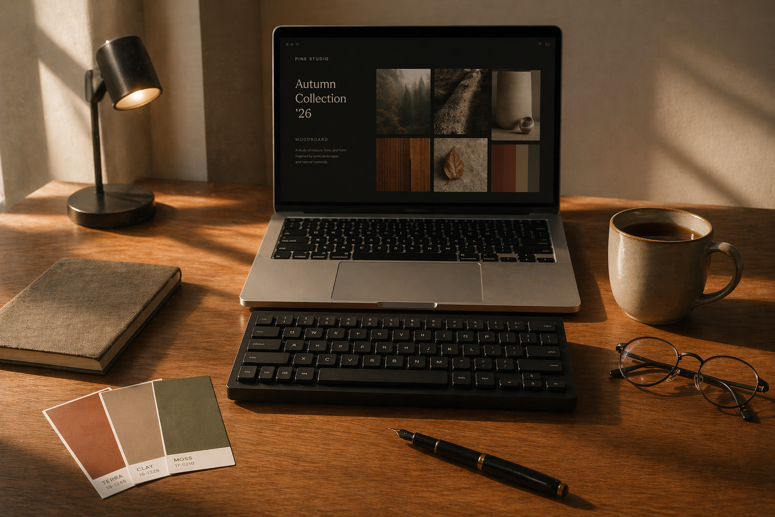
Prompt
Create a realistic designer workspace in late afternoon light.
Required objects:
- one silver laptop, open
- one black mechanical keyboard
- one ceramic mug with tea
- one notebook with a fabric cover
- three printed color swatches
- one small desk lamp
- one fountain pen
- one pair of thin-frame glasses
Composition rules:
- laptop centered
- keyboard directly in front of laptop
- mug on the right side
- notebook on the left side
- color swatches slightly fanned out near the notebook
- lamp at the back left corner
- pen diagonally near the bottom edge
- glasses near the mug
Material rules:
- laptop must look anodized aluminum
- keyboard keys slightly textured
- ceramic mug glossy but not mirror-like
- notebook cover woven fabric
- paper swatches matte coated stock
Lighting rules:
- warm sunlight from the left
- long soft shadows
- subtle dust in the light beam
- realistic exposure, not overly dramatic
Negative rules:
- no phone
- no mouse
- no plant
- no cables
- no extra papers
- no bookshelves
- no hands
The final image must feel calm, premium, believable, and professionally art directed.
測試點
測模型能否同時滿足大量物件、位置、材質、光線與負面條件。
好的判斷準則
所有指定物件都在,且位置、材質、數量正確。
沒有出現禁止項(手機、滑鼠、植物、電線等)。
光線、陰影、整體氣氛都符合「下午光、沉穩、乾淨」的描述。
不好的判斷準則
漏掉關鍵物件(例如沒眼鏡、沒色票)。
偷加多餘桌面雜物或裝飾植物。
材質表現與敘述不符,例如鋁合金看起來像塑膠。
22. 「真假品牌稿」測試
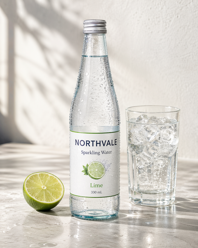
Prompt
Create a realistic premium beverage ad for a fictional sparkling water brand called NORTHVALE.
Show:
- one tall transparent bottle with condensation
- one sliced lime
- one clear tumbler with ice
- a clean stone surface
- soft morning sunlight
The bottle label must contain these exact words:
NORTHVALE
Sparkling Water
Lime
330 mL
Rules:
- The bottle branding must look real and commercially usable
- The label text must be readable
- Condensation must feel natural
- Water inside must look clear and physical
- No extra branding words
- Premium beverage ad quality
測試點
測假品牌在真實商廣環境中的可信度與標籤文字可讀性。
好的判斷準則
瓶身造型、標籤排版、字距等看起來和真實氣泡水品牌無異。
「NORTHVALE / Sparkling Water / Lime / 330 mL」清楚可讀、沒有拼錯。
水、凝結水珠、玻璃反光與背景光線都符合高級飲料廣告質感。
不好的判斷準則
標籤字體糊掉或變形、字母錯誤或缺字。
瓶身比例奇怪、看起來不像真實商品。
多加口味描述或品牌 slogan,違反「不加額外字」規則。
--
